.png)

roles
UX Researcher UX Designer UI Designer
duration
3 Week Design Sprint July 2022
tasks
Research Wireframes Prototyping IA Branding Testing
tools
Figma Figjam Loom Google Forms Maze trymyUI
BACKGROUND
What are people’s behaviors towards using health app and donating?
2019 study reported 13% of users have tracked health stats in the past.
2022 study reported
42% of users set up recurring donations more than one-time donors.
2022 study reported that 28% of online donations are made from mobile devices.
RESEARCH GOALS
Why do users start using a health app, but then stop?
Why do users prefer recurring donations over one time donations?
Why do users prefer to donate from mobile over online, mail-in, or in person?
SUMMARY
100% of participants have a positive feeling about working out. Similarly, 94.7% participants want to donate to charities , but blockers exist such as time and lack of money.
How might we conduct research to discover pain points with working out and donating to charity?
How might we validate the need for a mobile app to help users donate and?
AUDIENCE
My target audience was adults 18+ who work out or are interested in working out to help a charity of their choice.
The narrow target audience will help me conduct research with the intended audience of this future product.
Moderated
usability study
Remote United States
3 participants
ages 21-43
30-45 minutes
the mvp
-
Sponsees will be able to use this app to donate to charity by logging in to their walking activity.
-
Sponsees will learn more about charity and what donations are being used to make an informed choice about whom to walk for.
-
Sponsees will be able to participate in challenges to help motivate each other to stay active.
-
Sponsors will learn of who their sponsees are and send motivation periodically.
SOLUTION
Empactive is an attempt of giving users an easy way to donate without costing more time and money. It also focuses on building connections between both users’.
DISCOVER
I wanted to collect evaluative data on two competitor apps that encourage users to walk and exchange for money, products, donations, and participate in challenges. I decided to evaluate the strengths and weaknesses.
My main takeaway was that the apps could be improved with better accessibility, clearer CTA, and a simple flow for starting a workout and providing more information for users to learn about charities.
competitive analysis

how might we
I wanted to brainstorm all possible solutions to the problems so I started off writing down HMW for features, flows, visuals, layout, and accessibility for both Sponsor and Sponsees and favorited the ones that will work with the 4 weeks I have.

Grouping them into categories helped me narrow down my scope and I can finally see what should be prioritized.


surveys
I wanted to learn more about users' current behaviors, thoughts, and feelings about working out and donating to charity by generating a survey with Google Forms.
32 Respondents completed a Google Form survey working out and charity to uncover generative data on what are their pain points and motivations.


I believe communication effectively involves adapting how to deliver information so I decided to begin by pulling common answers and discovering themes and patterns with sketching.
What's the reason that stops you from working out?
What is the reason that stops you from donating to a charity?
What is a feature you would want in a charity/fitness app?


affinity diagram
I created an affinity diagram to document the insights and themes to prioritize working on building an app that is transparent about charities, and provides challenges, and workout stats.


key findings
80.8%
Users would be more active for a social cause.
94.7%
Users would donate if it didn't cost them money.
diary study
For this project, I wanted to learn how to implement a new research methodology to gather narrative data that the participants were asked to log their thoughts about their workout and explain what happened before they decided not to work out.

My takeaway from this is users enjoy workouts that fit into their schedule so this leads me to think of making sure my app makes it easy for a user to complete a workout.
interviews
I conducted 3 remote 30-minute interviews with participants recruited from my surveys with participants whom workout and have donated to a charity before. This interview focused on learning more about people's habits with working out and thoughts about donating to charity.
" I think one thing that would stick out to me about badges, metrics, and achievements is it’s most beneficial when it is least expected!." - Christine
"I would work out more if I had the time. ” - Thyda
"I would donate if it was easy to learn what the charity is using the donation for. " - Josh
3/3 of participants reported that they would use an app to track their steps to donate.
3/3 of participants reported they would find it beneficial if there was information with photos and text to describe the charity's mission and past projects. Learned of alert fatigue when providing motivational notifications in a workout app.
I wanted to build in a challenge feature so this was good to know when designing that feature.
personas
Here is a persona that is created based on common patterns of demographics, goals, behaviors, and frustrations from the survey data.

journey map
I developed a journey map to evaluate what he might be feeling from the first decision of working out and donating to a charity.
This validated the opportunities that Empactive could offer to solve the frustrations discovered.

DEFINE
user stories
I wrote down the possible steps that users needed to take to accomplish the MVP requirements. After going through them and evaluating them based on priority, I decided to focus on having users log their steps by walking or running and ruled out syncing to wearables for now due to the limited time available.

user flows
I designed two user flows for the Sponsor and Sponsee. As I was going through my iterations, I consistently tried to simplify the number of steps to complete the tasks.
My goal was only to have users interact with the necessary screens and require basic information.
sponsee flow

sponsor flow

site map
Here is my site map to organize how my app will be organized by content and type of users.

crazy 8 sketches
I sketched out 8 screens for the sponsee/sponsor. I presented this in a design critique and asked my team to use green dots (like) and red dots (questionable/dislike).
Thanks to my team for providing me feedback on the layout and suggestions on how to plan to design screens that have a layout where the hierarchy will focus on walking and charities.
sponsee sketches


DEVELOP
wireframes
I created wireframes and focused on having the same onboarding for Sponsee and Sponsor.


sponsee's iteration 2


sponsor's iteration 2


design changes

-
Reduced cognitive load for user by using Hick's law by giving limited choice of Charity options.
-
Added a search option to browse more charity options.
-
Removed settings and moved to profile dashboard

lo-fi prototype
usability study/developer
Test early and test often! As I gathered my insights and developed my wireframes, I had a developer test my lo-fi prototype using Maze with the goal to uncover any problems early.
I wanted to find out if I could actually build out my random badges generator for Sponsors to send badges of encouragement.
branding
Moodboard to help me picture the color scheme to help me prepare to develop my prototypes.

For logo development, I started to sketch out what I thought when thinking of working out and charity on paper. I sketched out possible logos and loved the combination of empathy and active.


For my design system, I focused on learning how to design components for efficiency to help with future collaboration.

hi-fi prototypes
visual feedback
I wanted to test my onboarding screen for visual feedback if users would want to see for onboarding screen with background choice and image choice. The results showed that users preferred a solid background instead of a gradient background and a graphical image instead of a real-life image.

"I'd prefer the more vibrant color in the topic. I find it more motivating, like an incentive.
I think the contrast of the magenta and the vibrant yellow is really refreshing" -Maze Tester

"I felt the first image was perfect based on what the app is. It shows a person running/being active and the flag with the heart symbol can give feelings of serenity and care"- Maze Tester
I recruited testers from User Researchers and UX slack groups and this feedback helped me learn how to prevent familiarity biases the next time I conduct A/B testing.
"Not easy to explain, just prefer the first. Also, it's important to add, that in this second choice I should have chosen from two options, and I have already seen one of them. As familiarity preference is a very strong psychological phenomenon (see e.g. Zajonc), I don't think the order of these 2 questions would work way better the other way around."- Maze Tester
Here is a walk-through of my hi-fi prototypes. I tested it myself multiple times to make sure all connections made sense for the preparation of conducting a usability study.
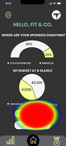
Sponsee's walk through by signing up, going for a walk, viewing stats, and donating to a charity.
Sponsor's walk though by signing up, viewing dashboard, and sending badges to motivate Sponsees.
DELIVER
Maze usability testing
2 Unmoderated Maze User Platform
United States
34/ Sponsee Participants
17 / Sponsor Participants
Untimed
Sponsee
usability score
70%
Sponsor
usability score
93%
sponsee / key findings


For the task to find Rainforest Alliance and learn more before adding to the user's charity list, there was a 16% misclick rate with 20% completing tasks with an unexpected path.
I learned from this insight that the second screen needs to be improved to be designed according to where users are expected to click to learn more about a charity.
sponsor / key findings


100% completed the task with the expected path to motivate their sponsees by sending badges, but 64% users left feedback on confusion on what badges are for and how it is helpful.
"I don't understand why I would use this as a business. What are the benefits to me? Is it just so I can put it in my annual report and show that I am doing something for environmental, social, and governance purposes?"- Maze tester
I learned from this insight to include more content that will let Sponsors know the purpose of badges and to explore other ways to build a connection between Sponsors and Sponsees.
trymyUI usability testing
System Usability Scale
70%
Task Completion Rate
100%
Unmoderated
trymyUI
Remote United States, Canada
5 paid participants
Untimed
"Boom, I walk. I donate to charity. Phenomenal Idea!"- trymyUI tester
5 participants were recruited by trymyUI and shared their screen, signed consent for the recording, and completed sponsee tasks while rating completion and usability with a Thinkaloud approach.
"Very easy to use, but not clearly communicated"- trymyUI tester
Analyzing the recordings uncovered the finding that the walk screen needed to be improved for a direct flow of viewing workout stats.
Users also wanted a direct CTA on the browse charity page to add to the screen as clicking on a card is an intuitive gesture to learn more.
"It's annoying that I had to hit the pause button to stop my walk"- trymyUI tester
post-testing changes
iteration 1


iteration 3
-
Adding more content on onboarding to let Sponsors know what the purpose of badges are.

-
Changed the "learn more" button to "add" for a quick addition to the user's charity list.
-
Added a select more than one charity option by prototyping pressed state for selected.

-
Changed play button to stop for a quick CTA to stop.
-
Planned for stop CTA to be less noticeable to encourage users to keep walking and avoid stopping by accident.

Sponsee's Prototype
Sponsor Prototype
mockups


takeaways and further steps
my introspection
-
Learn by doing and found UX community resourceful.
-
Less is more! Explored too many new research methods.
-
Could have started with evaluative research to save time with reaching out to competitor apps.
-
Not all projects result in immediate success, requires research, iterations, and lots of 🧋
-
Talk to users (active people/companies) to validate a need for a sponsor/sponsee relationship.
-
Explore more competitors on how they get users to download a fitness/charity app.
-
Plan to pivot or iterate after learning more of the user’s wants as a Sponsor.
Accomplished my MVP of creating a usable product to donate to charity by walking.
TLDR: "Easy, but not clear to understand."
I enjoyed learning new research tools (trymyUI, Diary Study) during my project.
expected business outcomes
-
Figure out what ROI would look like for stakeholders.
-
Define KPI to measure success if product launches.
-
Time on Task (Behavioral)
-
User Experience Questionnaire (UEQ) (Attitudinal)
-
Number of conversion rate of sign ups by a set date to meet goal (Business Centered)
-
Measure customer satisfaction (CSAT) (Attitudinal)