.png)

roles
UX Researcher UX Designer UI Designer
duration
4 Week Design Sprint March 2022-May 2022
tasks
Research Wireframes Prototyping IA Branding Testing
tools
Figma Figjam Notion Google Forms
SUMMARY
A busy bus stop has expanded in the midwest, newer bus routes have been added with additional buses. Riders are currently looking up bus routes on websites or watching their bus arrive outside.
The transit has the data to share with riders to determine different bus routes but needs an easy way to deliver this data. Washington & State stop has been receiving the most complaints from users with servicing 7 different bus lines. Using BUSSIT mobile app, riders can now look up their specific bus and know where, when, and how long they need to get to the bus stop on time.
PROBLEM
The Washington & State stop added several lines to their busy bus stop and bus riders are complaining about not knowing which route to take and how to get to the bus stop on time.
SOLUTION
BUSSIT solves the problem of bus riders being left unknowingly in the dark about where their bus is with live tracking, and what bus routes and arrivals time are currently offered at the busy Washington State bus stop by finishing this task in 4 to 6 clicks.
AUDIENCE
We are designing a solution for daily bus riders ages 18-46 who live in the metropolitan city area.

How might we design an easy-to-use mobile app to deliver the transit data to bus riders for the Metropolitan Transit Agency?
the mvp
-
Ensure that any rider can tell when each of the buses arrives at the Washington & State bus stop.
-
Ensure that all riders can tell how much time they have to get to the Washington & State bus stop before the bus they need arrives at that stop.
-
Allow riders to select one of seven bus lines to see a list of their future arrival times at the Washington & State bus stop.
DISCOVER
Using the iterative double diamond approach, I decided to dig deeper into the discovery phase to gather data and confirm what user needs and frustrations with their current bus experience.
.png)
competitive analysis
As a person that does not know enough about taking the bus, I wanted to learn about what direct competitors' apps are doing for accessibility, user flow, and visuals so I did a SWOT analysis.
Moovit
S
Good onboarding process
W
Small text and images
O
Supplementary text for icon
T
Offers travel rewards
.png)
Transit
S
CTA buttons/ text are clear
W
Not so intuitive pattern of use
O
Add more navigation buttons
T
Pretty colors / simple layout

City Mapper
S
Many transportation options
W
CTA colors are not clear
O
Improve accessibility
T
Share location with others

After gathering research into these three apps that people are already used to, I concluded that I needed to focus on clear accessible CTA, WCAG approved color contrast, and text size which would result in an easy-to-use app!
surveys
-
Created a survey with Google form while receiving feedback on accounting for biases to collect clear answers about users' thoughts and feelings about their bus ride experience.
-
Posted on slack channels, Instagram, and Reddit and received 37 responses, but still found it difficult to find enough information to represent a significant data pool.
What features do bus riders want in a mobile app?

What frustrations do you have as a bus rider?
What do you like the most about any mobile app you use a lot?

interviews
" I felt annoyed because I missed the bus and just wait to see when the next bus pulls up." - RYCHNY
"At this point, I feel like I trust the location more than the time prediction.” - MARCO
"I just memorized the intervals that the buses would come. I usually just winged it." - MONITA
-
Conducted remote 30-45 minute long interviews with 5 participants who were a mixed group of daily bus riders and occasional bus riders.
-
Started off as divergent thinking with thinking about all possible pain points, and mobile app favorites.
Now we have all this information so what do we do with it? We use convergent thinking to group them into similar behaviors, needs, pain points, and mobile features.

There's always more to discover...
Let's move into divergent thinking and sort the findings into common themes.

If there was unlimited time, we could address all those themes above, but in order to stay true to the MVP. I returned to convergent thinking by working on narrowing it down to the three business requirements.

-
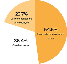
Users find mislabeled routes and lack of notifications for delays frustrating.
-
Users want clear navigation and layout in a mobile app.
-
Users want to view different departure times and routes at a bus stop.
-
Users want to see where the bus is physically instead of the time of arrival.
personas
I created two personas that represent two different groups of people from my interviews and surveys. I wanted to be able to make sure I wanted to create a user-centered design for both occasional riders and daily riders. They have different characteristics, but their needs are still similar for a bus app.


journey map
I stepped into Jame's shoes and followed him on a typical morning of taking the bus and wanted to understand his feelings and thoughts during each step of his journey. This was helpful to know at what part is he most frustrated for his bus ride.

discover wrap up
all users
1
want to view multiple routes at bus stop
all users
2
want a clear layout in an easy-to-use app
all users
3
want an option for live tracking
some users
4
-
want to share location with other people.
-
want to prepay for ticket.
-
want to favorite routes.
DEFINE
user stories

I used divergent thinking to think of all the possible user stories which are smaller tasks to complete a bigger task. This was my favorite as I love to break down how someone completes a task. Finally, I converged into the final three user stories that relate to the MVP.
As a bus rider, I want to know when my bus is arriving at the Washington & State bus stop, so I can calculate how much time I have to reach the bus stop.
As a bus rider, I want to know the next bus arriving at the Washington & State bus stop, so that I don’t rush to the bus stop if it is not my bus.
As a bus rider, I want the ability to view future arrival times for any of the seven bus lines (serving Washington & State), so that I know when my bus arrives.
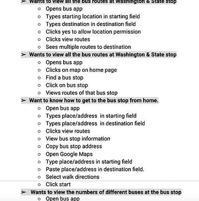
user flows
I created user flows to plan how James will interact with my bus app to complete his search for bus arrivals with and without GPS. This involved many iterations to understand what step is necessary to complete the task, especially when collaborating with developers to launch.
You can see this with iteration 1 including pinning on a map that changed to having the user manually input their start and end location.
ITERATION 1

ITERATION 4

site map
I created a site map to outline a blueprint of the hierarchy of elements that all live
under the home screen of the app. I started off trying to design a settings page for James to use to customize, however, this was out of scope so I converged back to the MVP.

wireframes
I created the wireframes for the design and started from paper wire flows and ended up with many iterations later with a design that has a better hierarchy and clear navigation options that supports my data from the discovery phase.
lo-fidelity iteration 1
wireflow

Design changes


mid-fidelity iteration 4


usability test / mid-fi prototype
Moderated
usability study
Remote United States
3 participants
ages 21-43
30-45 minutes
Task 1
The user was asked to find bus route by sharing GPS and without sharing GPS.
Task 2
The user was asked to find the bus arrival times in the app.
Task 3
The user was asked to return to home from bus arrival time screen.
Task 4
The user was asked to use live tracking to track a bus.
key findings
-
User did not find it clear to find bus arrival times when not sharing location.
-
Splash screen was too quick for user to get the branding
-
Users suggested expanding the map for better use of map.
-
Users thought bus label in the bus arrival time table were buttons.
-
User could not track the bus that was delayed.


DEVELOP
branding
I wanted to create a fun and memorable brand for BUSSIT, but with no visual design background. This was the hardest part of the process. So I used created a mood board and researched patterns to iterate for hi-fi prototypes. I started with divergent thinking of anything possibly related to the bus and narrowing down my ideas to my design system below.
why reinvent when you can research patterns?

moodboard of all things bus related (plan, passengers, punctual, and happy)

finally, a design system to keep it consistent and plan to pass on to developers

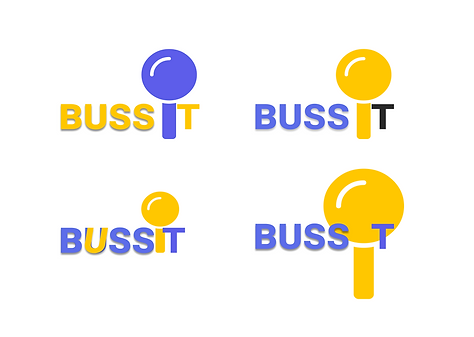
logo
As simple as pinning a location on the map, I wanted the logo to represent that by including a map pin inside the name. I started off with brainstorming on paper and resulted in a logo that represents pop culture, is fast to say, and evokes happiness.

hi-fi prototype

iteration 1
-
Added a keyboard to simulate a real-life experience for search
-
Moved the search bar out of map to make it more apparent
-
Added color lines on the map and clear bus icons and labels
iteration 1

-
Designing for the user who does not allow GPS was hard.
-
Changed CTA copy so search is more apparent

iteration 3
iteration 3


USER REVIEWS


IT WAS PRETTY STRAIGHTFORWARD TO USE!
RYCHNY
I FIND CLICKING THE BUS ICON ON THE MAP PRETTY USEFUL.
JENETA
I LIKE THAT THAT SEARCHING DIDN'T TAKE LONG.
MARCO
CONCLUSION
I created a user-approved product that addresses the MVP of the client by finding bus arrival times and routes by letting the user know how much time they need to be on time In the future, I plan on conducting usability studies on my current iteration to test if colored routes are useful to bus riders.
Ensure that any rider can tell when each of the buses arrives at the Washington & State bus stop.
Ensure that all riders can tell how much time they have to get to the Washington & State bus stop before the bus they need arrives at that stop.
Allow riders to select one of seven bus lines to see a list of their future arrival times at the Washington & State bus stop.
NEXT STEPS
-
want to share location with other people.
-
want to prepay for ticket.
-
want to favorite routes.
